
The form component is a container for input elements and provides built-in validation, error handling, and submission actions.
Usage
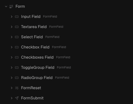
Within the Form component, you can include a range of elements to capture user input. The available elements include:
Form Element | Purpose |
Input Field | Collects single-line data such as names or email addresses. |
Textarea Field | Captures multi-line input, such as messages or descriptions. |
Select Field | Displays a dropdown list for single or multiple selections. |
Checkbox/Checkboxes Field | Allows users to select one or multiple options. |
ToggleGroup Field | Provides a set of toggle options for single or multiple selections. |
RadioGroup Field | Lets users select only one option from a set. |
FormSubmit | Submits the form data (typically used as the Submit button). |
FormReset | Resets the form fields to their initial values. |
Adding a Form
To add a Form to your page:
- Open the Insert Menu and navigate to Components.
- Drag and drop the Form component onto your page.
- Build your form by inserting and removing form elements (like Input Fields, Textareas, Checkbox Fields, etc.) as needed.
Guides
Validation
Validation happens by default to make sure the information entered is correct. For more advanced checks, you can add a custom schema using zodSchema.
To add custom validation:
- Select the Form component.
- In the Properties Panel, set the zodSchema property with your custom action (this may involve writing a small function).
Submitting the Form
You can define what happens when the form is submitted (for example, triggering API calls, updating state, or navigating to another page). This is done using the onSubmit property.
To configure form submission behavior:
- Ensure your form includes a FormSubmit component.
- Select the Form component and open the Properties Panel.
- Set the onSubmit property to trigger your desired actions (such as API calls or navigation).
Reset Button
A reset button allows users to clear all inputs in the form.
To add a reset button:
- Open the Insert Menu and navigate to Form Components.
- Add the FormReset component to your form.
- Adjust its style and positioning using the Properties Panel.
Custom Error Messages
Each form field can display custom error messages for different validation scenarios (e.g., required fields, maximum length).
To customize error messages:
- Select a form field component (such as an Input Field).
- In the Properties Panel, edit the appropriate error message properties (e.g.,
requiredMessage,customValidationMessage,maxLengthMessage, etc.)
Action?
The
action property is the default HTML action attribute. It specifies the URL where the form data should be sent when the form is submitted. To set this, select the Form component and enter the target URL in the Action field within the Properties Panel.Method?
The
method property determines how form data is sent. You can choose between:- GET – Appends form data to the URL.
- POST – Sends data in the request body.
To set the method:
- Select the Form component.
- Go to the Properties Panel.
- Choose your desired method (GET or POST) from the
methodproperty.
Redirect Site Visitors on Form Submission?
You can automatically redirect users after the form is submitted by setting the redirect property.
To configure redirection:
- Select the Form component.
- In the Properties Panel, set the redirect property with the target URL.
Properties
Form
Property | Type | Default | Description |
defaultValues | Object | - | An object that defines the initial values for the form fields. |
debounced | boolean | false | If enabled, input validation is debounced to reduce frequent updates. |
debounceTime | number | 100 | The debounce delay in milliseconds. |
onSubmit | Action | - | The action that is triggered when the form is submitted. |
zodSchema | Helper | - | A Zod schema for advanced validation of form data. |