
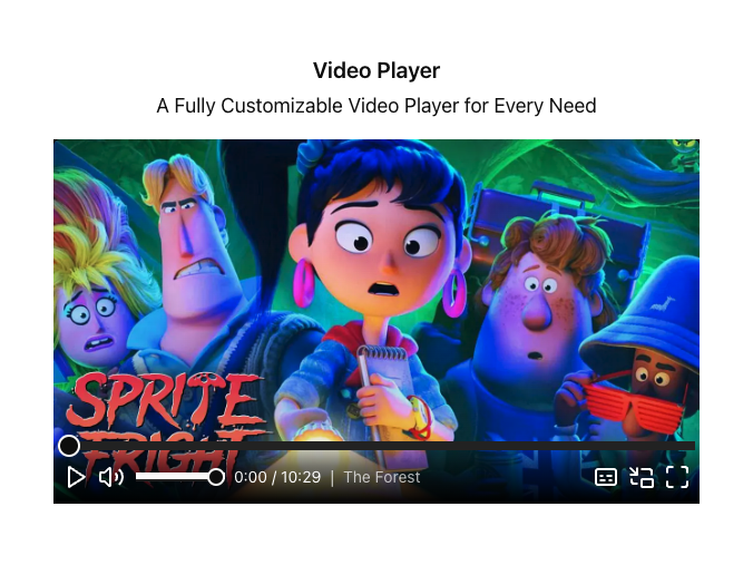
Video Player provides a set of components and templates that allow you to use a plug-and-play player or customize your own to make it just right.
Powered by the following open source library:
GitHub - vidstack/player: UI components and hooks for building video/audio players on the web. Robust, customizable, and accessible. Modern alternative to JW Player and Video.js.
UI components and hooks for building video/audio players on the web. Robust, customizable, and accessible. Modern alternative to JW Player and Video.js. - vidstack/player
https://github.com/vidstack/player#vidstack-player
Our library contains two pre-built players
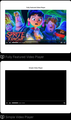
Simple Video Player
The Simple Video Player is the one you should reach in most cases. It ships with:
- Controls bar: Play/Pause, Audio, Picture-in-picture and Fullscreen
- Video Poster
- Buffering Indicator
- Gestures
Fully Featured Video Player
This version of the player has everything from Simple Video Player but additionally, it ships with:
- Captions
- Captions settings
- Chapters
- Thumbnails
- Playback settings (Coming soon)
- Quality settings (Coming soon)
If you require a player with these features or want to create your own from a fuller version, this is the one you want to reach for.
Adding a Video Player
- Open the Insert Menu (
i) > Components.
- Drag the desired VideoPlayer onto your page.
- Set src property to a link or pick a local file (for files over 20MB, use a link)
- If you chose the Fully Featured Player, ensure that you configure the VideoPoster and VideoTrack components too. Remember, if anything is unnecessary on your player, you can always remove it.
Guides
The Video Player Library ships with multiple components and templates. These templates are built to be completely extendable and customizable so that you can achieve anything that you could achieve with code.
Enabling Auto Play
- Select VideoPlayer
- Add
autoPlayproperty from optional properties list
- Set it to
true
Components
In this section you will find the list of the provided components and their configuration.
VideoPlayer
This is the top-most component in the library used to group media elements and control the flow of media state.
Properties
Property | Type | Default | Description |
src | media | undefined | The URL or object of the current media resource/s to be considered for playback. |
autoPlay | boolean | false | Whether playback should automatically begin as soon as enough media is available to do so without interruption. |
controls | boolean | false | Indicates whether a user interface should be shown for controlling the resource. Set this to false when you want to provide your own custom controls, and true if you want the current provider to supply its own default controls. |
loop | boolean | false | Whether media should automatically start playing from the beginning (replay) every time it ends. |
aspectRatio | string | undefined | Aspect ratio of video. (ex: 16/9, 4/3) |
clipEndTime | number | 0 | Limit playback to only play before a certain time. Playback will end at this time. |
clipStartTime | number | 0 | Limit playback to only play after a certain time. Playback will begin from this time. |
controlsDelay | number | 2000 | The default amount of delay in milliseconds while media playback is progressing without user activity to indicate an idle state and hide controls. |
crossOrigin | 'anonymous' | 'use-credentials' | null | Defines how the media element handles cross-origin requests, thereby enabling the configuration of the CORS requests for the element's fetched data.
|
fullscreenOrientation | 'landscape' | 'portrait’ | Indicates the orientation to lock the screen to when in fullscreen mode and the Screen Orientation API is available.
| |
hideControlsOnMouseLeave | string | 'landscape' | Whether controls visibility should be toggled when the mouse enters and leaves the player container. |
keyDisabled | boolean | false | Whether keyboard support is disabled for the media player globally. This property won't disable standard ARIA keyboard controls for individual components when focused. |
load | 'play' | 'visible' | 'eager' | 'idle' | 'custom’ | 'visible' | Indicates when the provider can begin loading media.
eager: media will be loaded immediately.
idle: media will be loaded after the page has loaded and requestIdleCallback is fired
visible: media will delay loading until the provider has entered the viewport.
custom: media will wait for the startLoading() method or media-start-loading event.
play: media will delay loading until there is a play request |
muted | boolean | false | Whether the audio is muted or not. |
paused | boolean | false | Whether the video is paused or not. |
title | string | '' | The title of the current media. |
volume | number | 1 | An int between 0 (silent) and 1 (loudest) indicating the audio volume. Defaults to 1. |
VideoProvider
This component is used as a render target for the current provider.
Properties
Property | Type | Default | Description |
iframeProps | IframeHTMLAttributes<HTMLIFrameElement> | undefined | Properties passed to the iframe where the video is rendered |
autoPlay | HTMLAttributes<HTMLMediaElement> | undefined | Properties passed to the video tag where the video is rendered |
VideoPoster
This component is used to display a media poster or thumbnail image, generally before playback begins. It should be placed inside VideoProvider.
Properties
Property | Type | Default | Description |
src | media | undefined | The URL of the poster image resource. |
alt | string | undefined | Provides alternative information for a poster image if a user for some reason cannot view it. |
crossOrigin | 'anonymous' | 'use-credentials' | null | Defines how the img handles cross-origin requests, thereby enabling the configuration of the CORS requests for the element's fetched data. |
VideoTrack
This component is used to add text tracks - usually subtitles or chapters. It should be placed inside VideoProvider.
Properties
Property | Type | Default | Description |
src | media | undefined | URL of the text track resource. |
id | string | undefined | A unique identifier. |
content | string | undefined | Used to directly pass in text track file contents. |
type | 'json’ | 'vtt' | 'srt' | 'ssa' | 'ass’ | 'vtt’ | The captions file format to be parsed or a custom parser factory (functions that returns a captions parser). |
enconding | string | 'utf-8' | The text encoding type to be used when decoding data bytes to text. |
default | boolean | false | Indicates that the track should be enabled unless the user's preferences indicate that another track is more appropriate. This may only be used on one track element per media element. |
kind | 'captions' | 'chapters' | 'descriptions' | 'metadata' | 'subtitles' | undefined | The kind of text track this object represents. This decides how the track will be handled by the player. |
label | string | undefined | A human-readable label for the text track. This will be displayed to the user. |
language | string | undefined | A string containing a language identifier. For example, "en-US" for United States English or "pt-BR" for Brazilian Portuguese. |
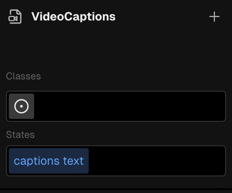
VideoCaptions
This component is used to render and display captions/subtitles. Should be placed inside VideoPlayer.
Properties
Property | Type | Default | Description |
textDir | 'ltr' | 'rtl' | 'ltr' | Text direction |
exampleText | string | undefined | The text to be displayed when an example caption is being shown. |
This component also ships with a Style Selector that allows you to style its captions text.
BufferingIndicator
This component renders a buffering indicator when the video is loading. It should be placed inside a VideoPlayer.
Customizable version coming soon!
VideoControlsRoot
This component creates a container for control groups. It will display or hide the controls based on the your configuration. It should be placed inside VideoPlayer.
Properties
Property | Type | Default | Description |
hideDelay | number | 2000 | The default amount of delay in milliseconds while media playback is progressing without user activity to hide the controls. |
hideOnMouseLeave | boolean | false | Whether controls visibility should be toggled when the mouse enters and leaves the player container. |
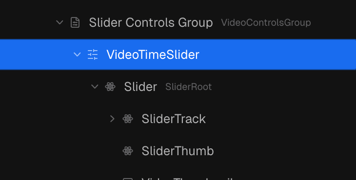
VideoControlsGroup
This component creates a container for media controls. It should be placed inside VideoControlsRoot.
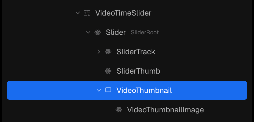
VideoTimeSlider
This components is a behaviour that controls the time Slider. It should be placed inside VideoControlsGroup and it expects a Slider as its content.
VideoThumbnail
This component is used to load and display thumbnail images. It is usually placed inside the time Slider.
Properties
Property | Type | Default | Description |
thumbnails | media | undefined | The thumbnails resource. |
crossOrigin | 'anonymous' | 'use-credentials’ | null | Defines how the media handles cross-origin requests, thereby enabling the configuration of the CORS requests for the element's fetched data. |
VideoThumbnailImage
This component is used as a render target for your thumbnail image. It should be placed inside VideoThumbnail.
VideoPlayButton
This component is used to play and pause media on press. It is a behaviour component and sets logic its logic a children Button.
Properties
Property | Type | Default | Description |
disabled | boolean | false | Whether the button should be disabled (non-interactive). |
VideoMuteButton
This component is used to mute and unmute media on press. It is a behaviour component and sets its logic on a children Button.
Properties
Property | Type | Default | Description |
disabled | boolean | false | Whether the button should be disabled (non-interactive). |
VideoMuteButton
This component is used to mute and unmute media on press. It is a behaviour component and sets its logic on a children Button.
Properties
Property | Type | Default | Description |
disabled | boolean | false | Whether the button should be disabled (non-interactive). |
VideoButtonPiP
This component is used to enter and exit picture-in-picture mode on press. It is a behaviour component and sets its logic on a children Button.
Properties
Property | Type | Default | Description |
disabled | boolean | false | Whether the button should be disabled (non-interactive). |
VideoFullscreenButton
This component is used to enter and exit fullscren mode on press. It is a behaviour component and sets its logic on a children Button.
Properties
Property | Type | Default | Description |
disabled | boolean | false | Whether the button should be disabled (non-interactive). |
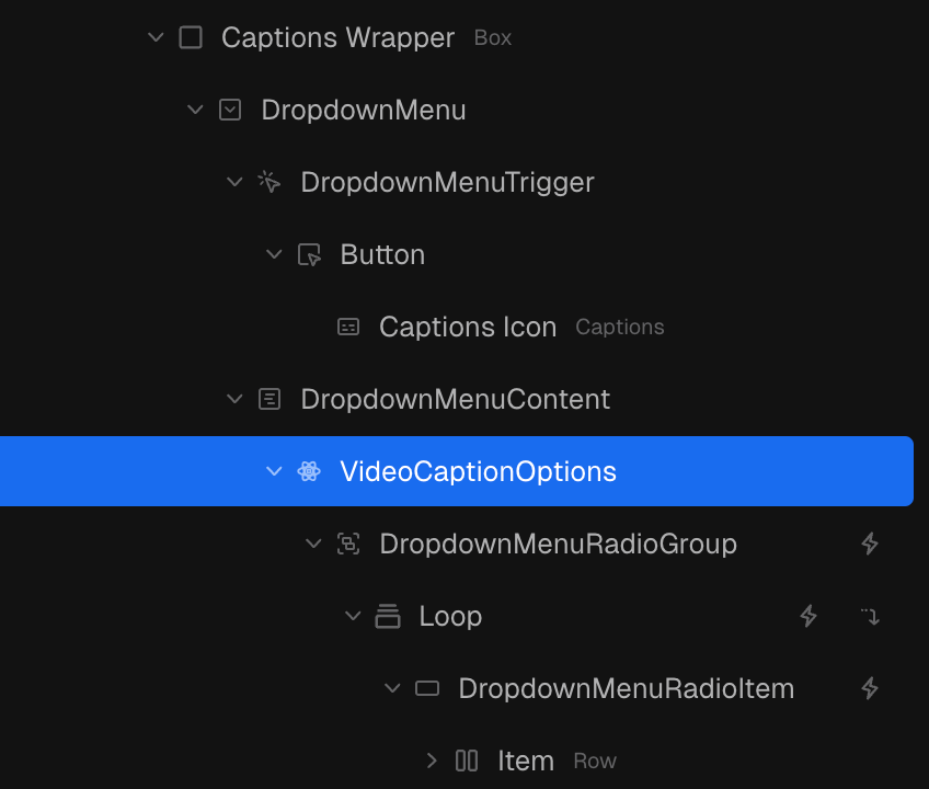
VideoCaptionOptions
This component registers state and actions that are helpful to build captions settings:
captionOptions - An array of the existing caption options
captionSelectedValue - The currently selected caption
changeMediaCaption - An action that enables changing the enabled caption
VideoGesture
This component enables actions to be performed on the media based on user gestures. It should be placed inside VideoPlayer.
Properties
Property | Type | Default | Description |
action | 'play' | 'pause' | 'seek' | 'toggle:controls' | 'toggle:fullscreen' | 'toggle:muted' | 'toggle:paused' | undefined | An action describes the type of media request event that will be dispatched, which will ultimately perform some operation on the player. |
seekAmount | number | undefined | If action is 'seek', this is the amount of seconds to seek. (negative values seek backwards) |
event | keyof HTMLElementEventMap | dbl${keyof HTMLElementEventMap} | undefined | The DOM event type that will trigger this gesture. It can be any valid DOM event type. Any event can be prefixed with dbl to ensure it occurs twice in succession (max 200ms gap). |
VideoTime
This component is used to display certain media states as a unit of time, such as the current time or duration. It should be used under VideoControlsGroup or VideoControlsRoot.
Properties
Property | Type | Default | Description |
type | 'buffered' | 'duration' | 'current' | 'current' | The type of media time to track. |
toggle | boolean | false | Whether on press the time should invert showing the remaining time (i.e., toggle the remainder prop). |
showHours | boolean | false | Whether the time should always show the hours unit, even if the time is less than 1 hour. |
remainder | boolean | false | Whether to display the remaining time from the current type, until the duration is reached. |
padMinutes | boolean | null | Whether the minutes unit should be padded with zeroes to a length of 2. |
padHours | boolean | null | Whether the hours unit should be padded with zeroes to a length of 2. |
hidden | boolean | false | Provides a hint that the time is not visible and stops all events and updates to be more power efficient. |
VideoChapterTitle
This component is used to display the current media title.