
The GoogleMap component lets you embed and customize interactive Google Maps into your projects. Under the hood, our component is powered by react‑google‑maps, offering a rich set of customization options—from basic configurations like setting the center and zoom level, to advanced features such as custom markers and info windows.
Important
You will need to obtain a Google Maps API key to use the GoogleMap component on your published site. To get an API key, please follow these instructions.
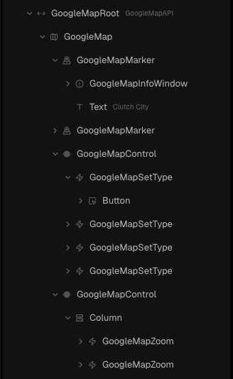
Structure
The Google Maps Library ships a template with a few example like markers, pins, controls, etc.
Add a Google Map
- Open the Insert Menu (
i) > Components.
- Drag the GoogleMapRoot onto your page.
- Select GoogleMapRoot (GoogleMap API) and add your API key
GoogleMap requires a wrapper with a fixed size
Guides
Here are practical examples of how to use the Google Maps library:
Centering the map
GoogleMap allows you to choose a default position for the map. In this example, we’ll center Houston Zoo.
- Get the latitude and longitude of your desired center.
- Select GoogleMap and update the defaultCenter property to match the desired position
Right-clicking a spot on Google Maps allows you to copy its coordinates
Adding Markers
You can mark spots that you want to highlight by using Marker Pin and InfoWindow. In this example, we’ll use the GoogleMapsMarker template that ships with:
- GoogleMapsMarker
- GoogleMapInfoWindow
- GoogleMapPin
Steps
- Find GoogleMapMarker from the Google Maps Library and add it onto your GoogleMap
- Select the added GoogleMapMarker and configure its latitude and longitude to match the desired position
Components
GoogleMapAPI
This component should be the root of any Google Map components. It is used to connect to the Google Maps API and the place to set the API key.
Properties
Property | Type | Default | Description |
apiKey | string | undefined | Google Maps API Key (required). You need to create a Google Maps API key to use this component in production. |
GoogleMap
This component is what renders the map.
Properties
Property | Type | Default | Description |
defaultCenter | {
lat: number;
lng: number;
} | undefined | The default longitude and latitude for the center of the map. |
defaultZoom | number | 12 | The initial resolution at which to display the map. The values range from 0 to 22, the level of detail for different zoom-levels is approximately:
1: Entire World
5: Landmass/continent
10: City
15: Streets
20: Buildings
The Maps JavaScript API Documentation has some more information on this topic |
disableDefaultUI | boolean | false | Disables the default UI |
defaultBounds | object | undefined | An alternative way to specify the region that should initially be visible on the map. Has otherwise the same effect as defaultCenter and defaultZoom.
The defaultBounds type is an extension of google.maps.LatLngBoundsLiteral that can also contain the optional property padding: number | google.maps.Padding that represents padding in pixels for the initial view. The bounds will be fit in the part of the map that remains after padding is removed. A number value will yield the same padding on all 4 sides.
|
defaultHeading | number | 0 | The default heading of the map in degrees, measured clockwise from cardinal direction North. |
defaultTilt | number | 0 | For vector maps, sets the angle of incidence for the map, in degrees from the viewport plane to the map plane.
The allowed values are restricted depending on the zoom level of the map:
for zoom-levels below 10, the maximum value is 30,
for zoom above 15.5, the maximum value is 67.5
between 10 and 15.5, it is a piecewise linear interpolation (see here for details) |
defaultMapTypeId | string | ROADMAP | The initial Map mapTypeId |
colorScheme | DARK | LIGHT | FOLLOW_SYSTEM | FOLLOW_SYSTEM | The color-scheme to be used by the map |
mapId | string | undefined | The Map ID of the map.
This is required if you want to make use of the Cloud-based maps styling. |
GoogleMapMarker
This component can be a marker of any kind. The received children will be rendered as the marker on the marker’s position. If no children is passed, it will render a simple Pin as the marker.
This component integrates with GoogleMapInfoWindow. If GoogleMapInfoWindow is used as part of children, it will be controlled by the marker and automatically toggle the open state when the marker is clicked.
Properties
Property | Type | Default | Description |
lat | number | undefined | The latitude of the marker. |
lng | number | undefined | The longitude of the marker. |
isInfoWindowDefaultOpen | boolean | false | If the marker’s GoogleMapInfoWindow should be open by default |
GoogleMapPin
This component is used to render a pin inside a marker.
Properties
Property | Type | Default | Description |
background | string | null | The background color of the pin shape. Supports any CSS color value |
borderColor | string | undefined | The border color of the pin shape. Supports any CSS color value |
scale | number | 1 | The scale of the pin |
glyph | string | Element | URL | null; | undefined | The DOM element displayed in the pin. |
glyphColor | string | undefined | The color of the glyph. Supports any CSS color value |
GoogleMapInfoWindow
This component is used to render an info window on the map or on a specific marker. Passed children will be rendered inside the window. This includes useful links, opening times of your business, etc.
If it is placed inside a GoogleMapMarker, it will be anchored to the marker and open/close when the marker is clicked.
Properties
Property | Type | Default | Description |
lat | number | undefined | The latitude of the marker (if not inside a marker) |
lng | number | undefined | The longitude of the marker (if not inside a marker) |
onClose | () ⇒ void | undefined | Event called when the info window is closed |