
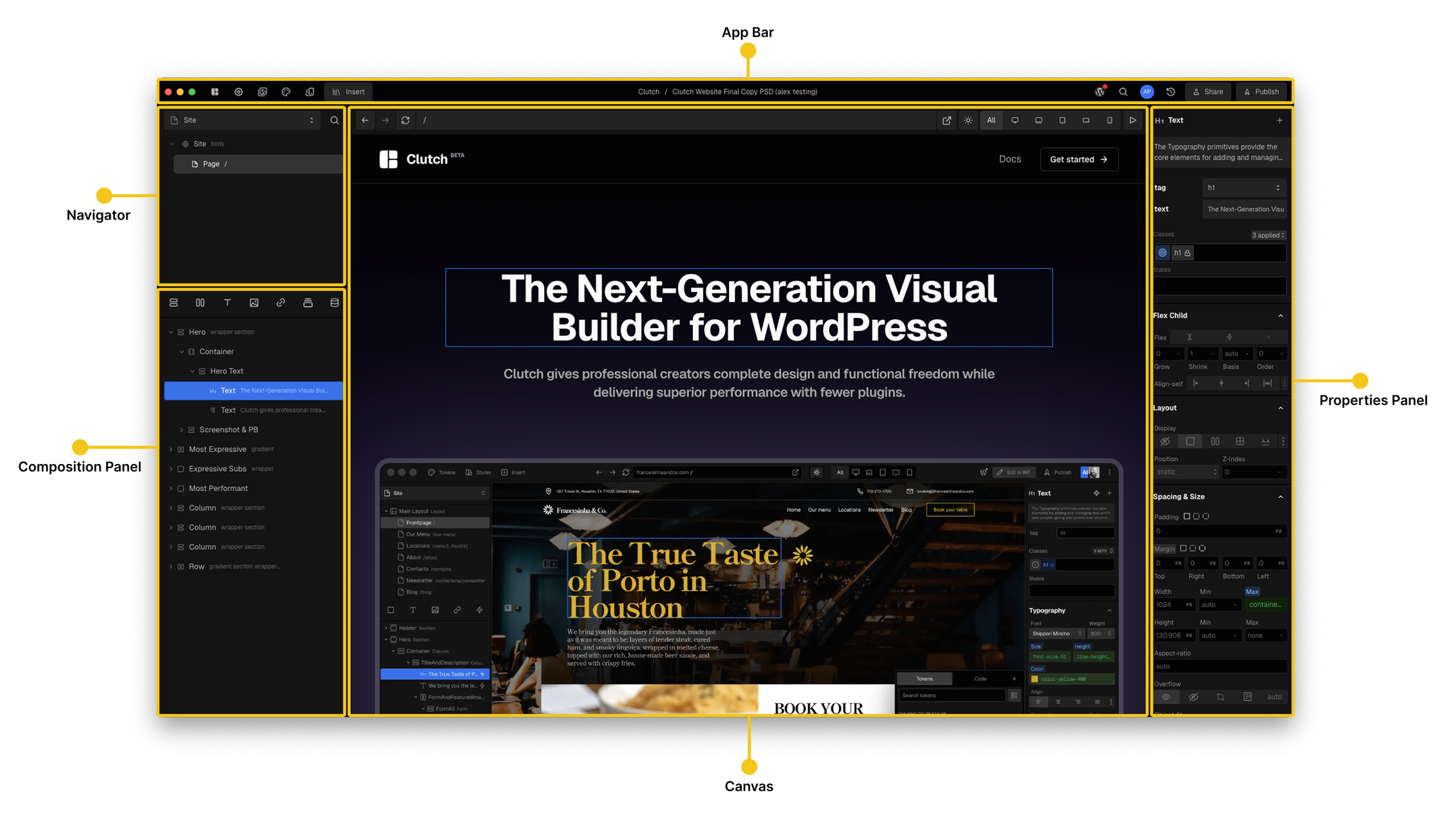
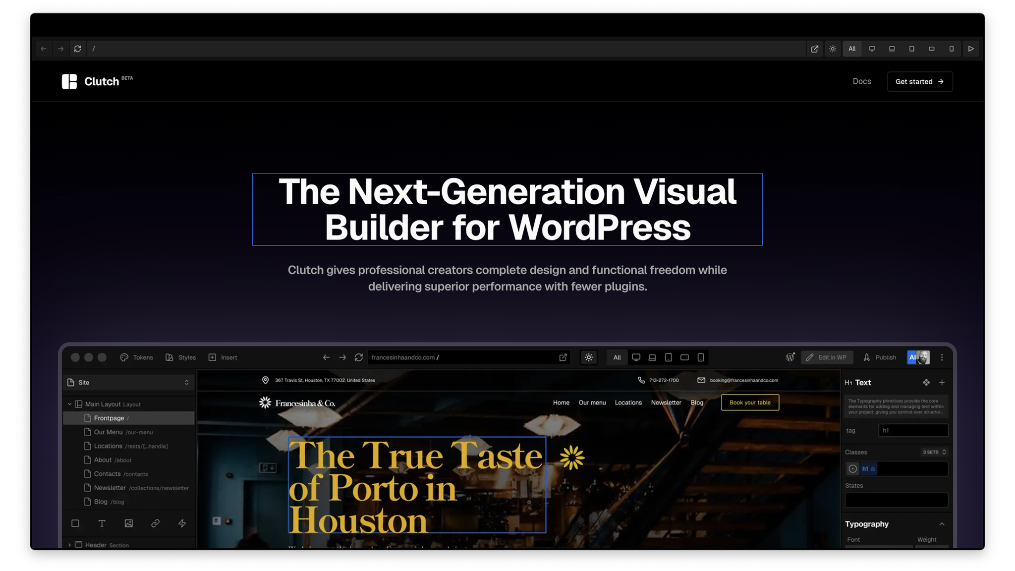
Once you create a project you will be taken to the Project Editor. The editor has five main sections: App Bar, Navigator, Composition Panel, Canvas, and Properties Panel.
App Bar
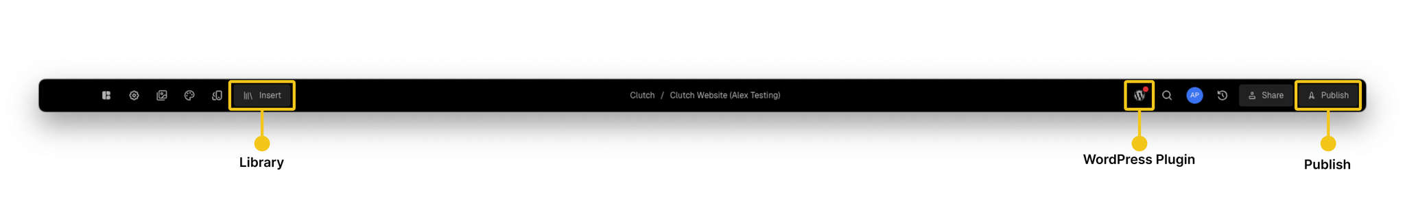
The App Bar runs along the top of the workspace and provides quick access to key project controls:
- Library – Browse and insert pages and components created or installed in your project.
- Project Settings – Access project-level settings like fonts and package management.
- Media – Upload and manage media from your computer’s file system.
- Tokens – Tokens are custom style variables that can be applied to the style properties of your components. The tokens panel is where you can manage your project’s tokens.
- Classes – Use classes to save styling information that applies to as many elements as you want across your site. The Classes modal is where you can manage the classes created in your project.
- Project Name – View the current project name. Double-click to rename.
- WordPress Plugin Manager – Connect and manage your WordPress backend.
- Search – Search across pages, components, and templates in your project.
- Active Users – Displays current collaborators in the project.
- History – View and revert to previous versions of your project.
- Share – Invite others to collaborate on your project.
- Publish – Instantly publish to Clutch Hosting, submit to the Marketplace, or publish to npm.
Navigator
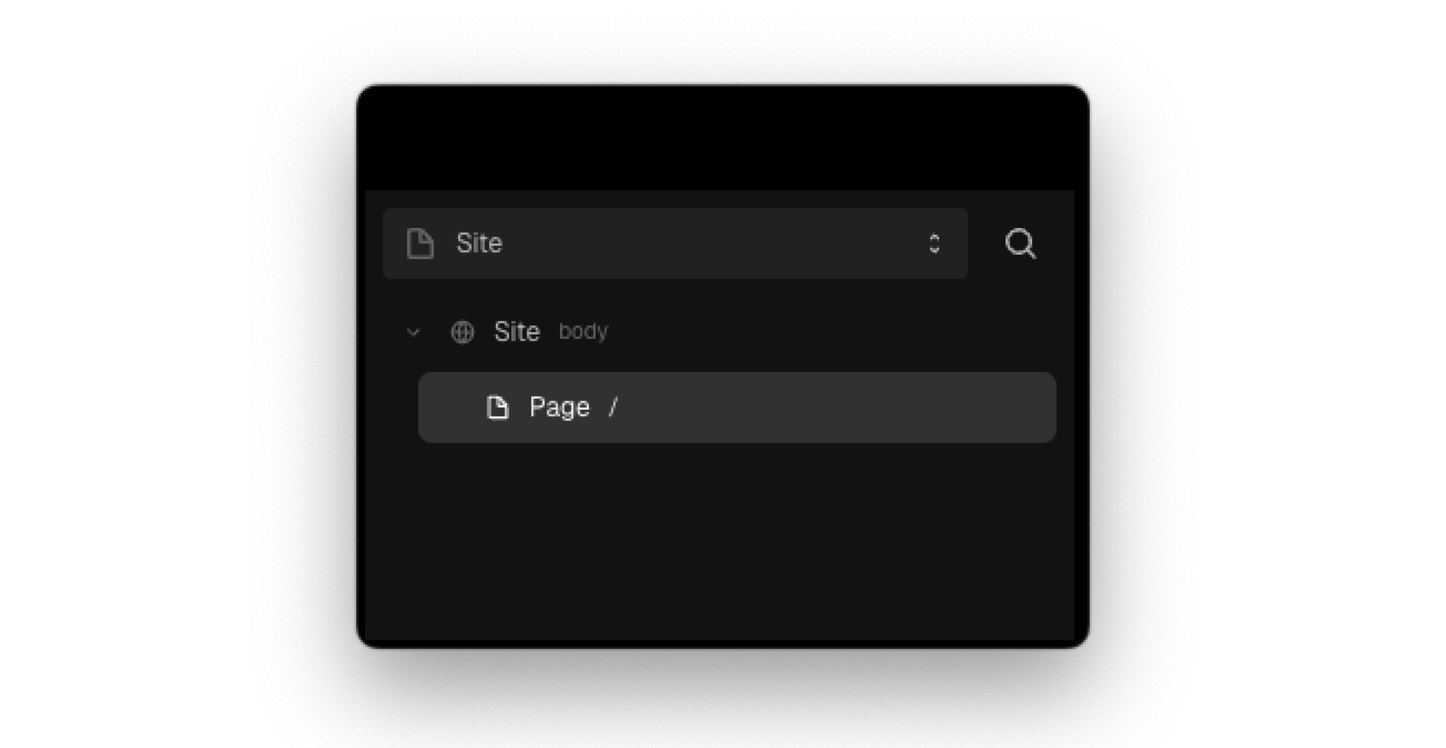
Projects have different modes that can be set to work in. You can work on the project site, components, or boards.
- Building a Site – Structuring pages and layouts to create a full website.
- Creating Components – Designing reusable elements that can be used across your project.
- Using Boards – Ideating, prototyping, and organizing designs before implementation.
The Navigator is how you switch between these working modes, helping with organization and management.
Composition Panel
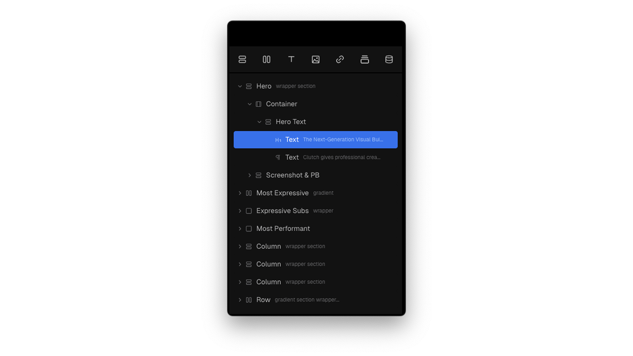
The Composition Panel displays the components on the current page in a hierarchical tree structure. It allows you to select and reorder any component(s) on a page.
At the top of the panel, a strip of frequently used primitives provides quick access to essential building blocks. This allows for a faster workflow when structuring layouts and designing compositions.
Properties Panel
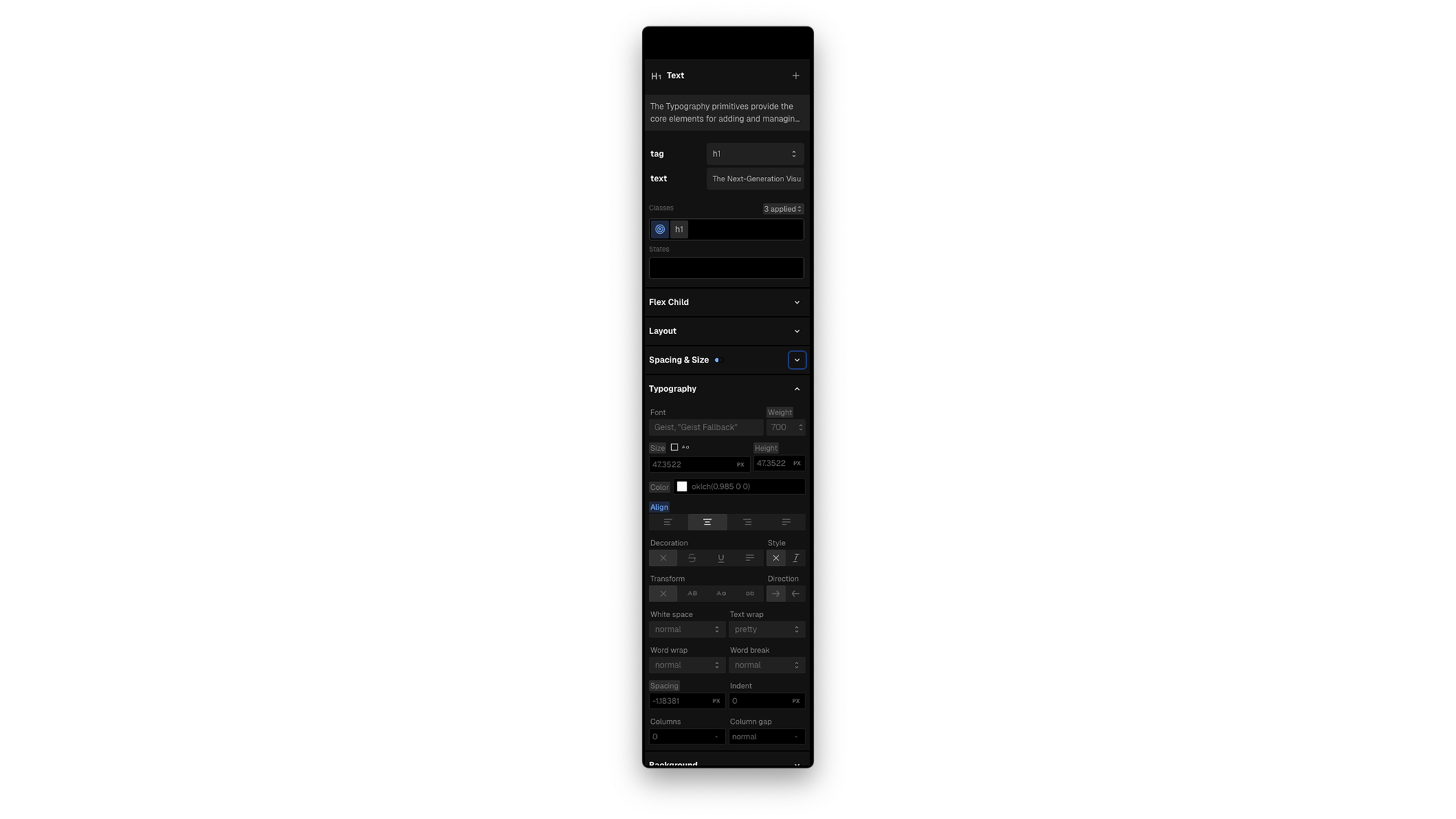
The Properties Panel lets you modify both the visual appearance and interactive behavior of a selected component.
- Component Properties – These are functional or documented properties specific to the selected component (e.g.,
srcfor an Image orhreffor a Link). They appear at the top of the panel.
- Styling Properties – Below the component properties, you can visually adjust any CSS-based styles such as layout, spacing, typography, colors, borders, and effects.
Canvas
The Canvas is the central workspace where you build and edit your project. You can visually arrange layouts, style components, and make real-time changes by interacting directly with elements on the page.